
Lurox User Guide
Build, preview and publish storefront pages and blocks β visually, with version history built in.
What is Lurox?
Lurox is a visual page builder for your storefront. Instead of editing raw HTML, you assemble a page from components β a hero banner, a block of rich text, an image-and-text row, a product grid, and so on β and arrange them by dragging, editing each one in a simple properties panel. Lurox stores your content as structured, typed data, which means clean version history, instant previews at three screen sizes, and pages that stay consistent with your theme.
This very page was built and published with Lurox.
The four building blocks
Lurox has four nouns. Learn these and everything else falls into place.
| Term | What it is |
|---|---|
| Page | A full storefront page at its own URL (like this one). Has page chrome β header, footer β and a layout. |
| Block | A reusable piece of content you can drop into many places β a promo strip, an "about us" panel, a footer callout. |
| Template | A ready-made blueprint for a block. Start from a template to get a polished block in one click, then edit it. |
| Placement | The decision of where a block appears β assigning a block to a named slot on your storefront, per store. |
A typical flow: start from a Template → it creates a Block you edit in the Lurox editor → you Place that block into a storefront slot. Pages are edited the same way, but they live at their own URL.
The editor at a glance
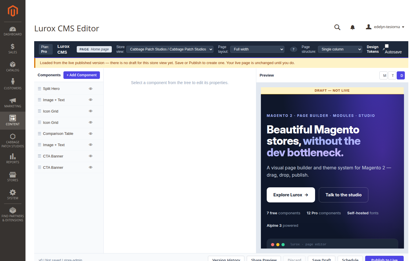
Open any Lurox-managed page or block and you land in the editor. It has four regions:
- The toolbar (top) β shows whether you're editing a Page or a Block, your plan, the store view you're editing, and the page's Layout and Structure.
- Components panel (left) β the ordered list of components on the page, with + Add Component at the top. Drag to reorder; each row can be switched off without deleting it.
- Properties (centre) β select a component to edit its fields here.
- Preview (right) β a live render of your draft. Toggle M / T / D (mobile, tablet, desktop) to check responsiveness. A yellow DRAFT β NOT LIVE banner reminds you nothing is public until you publish.
Building a page
- Add a component. Click + Add Component and choose from the picker. Components are grouped by category and labelled Free or Pro.
- Edit its properties. Select the component; fill in its fields in the centre panel. Every field has a short description. Text fields, dropdowns, image pickers and repeatable lists are all supported.
- Reorder. Drag components in the left panel to change their order on the page.
- Show / hide. Toggle a component off to hide it from the storefront while keeping it for later β handy for seasonal content.
- Preview responsively. Use the M / T / D buttons to confirm the layout works on phones, tablets and desktops.
Page layout & structure
Two page-level choices live in the toolbar:
- Layout β Full width (standard header & footer), Boxed (the page sits in a centred frame), or Landing (header and footer hidden, for campaign pages).
- Structure β Single column, or Two column to add a sidebar beside the main content (it stacks below on mobile). Two-column is a Pro feature.
The component library
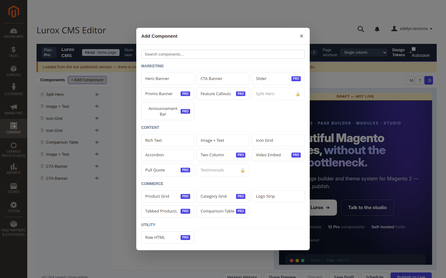
Lurox ships a library of typed components. Free components are available on every store; Pro components unlock with a Pro plan.
| Plan | Components |
|---|---|
| Free | Hero banner, Rich text, Image & text, Call-to-action banner, Icon grid, Accordion, Logo strip |
| Pro | Product grid, Category grid, Two-column, Raw HTML, Slider, Tabbed products, Promo banner, Video embed, Pull quote, Comparison table, Feature callouts, Split Hero |
Some components connect to other Cabbage Patch Studios modules β for example the Testimonials component appears in the picker only when the Testimonials module is active. See the Testimonials User Guide.
Block Templates
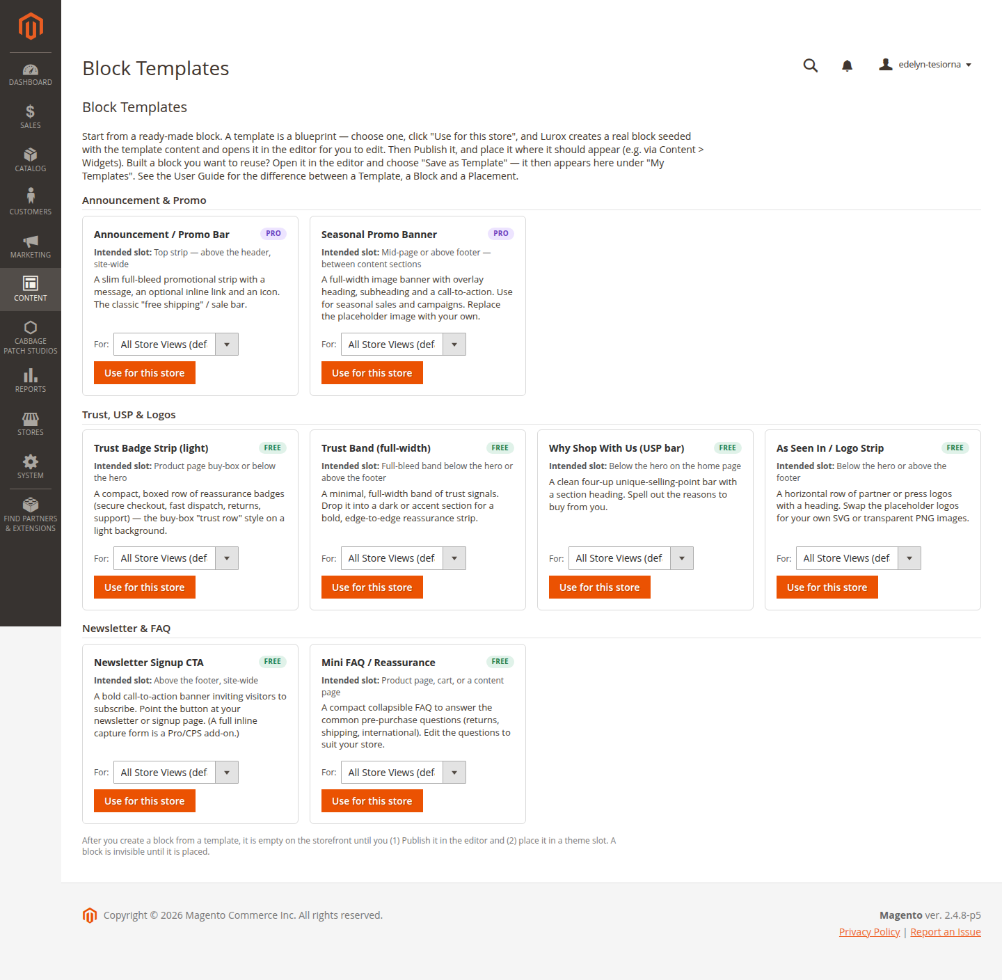
You don't have to start from a blank block. The Block Templates gallery (Content → Lurox CMS) offers ready-made blueprints. Choose one, click Use for this store, and Lurox creates a real block seeded with the template's content and opens it in the editor for you to customise.
Built a block you'd like to reuse? Open it in the editor and choose Save as Template. It then appears in the gallery under My Templates, ready to instantiate again β on this store or another.


Placements β putting blocks on the storefront
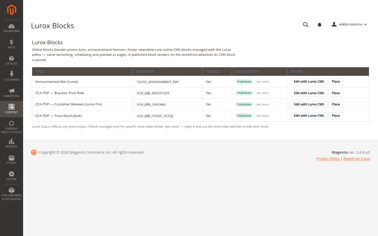
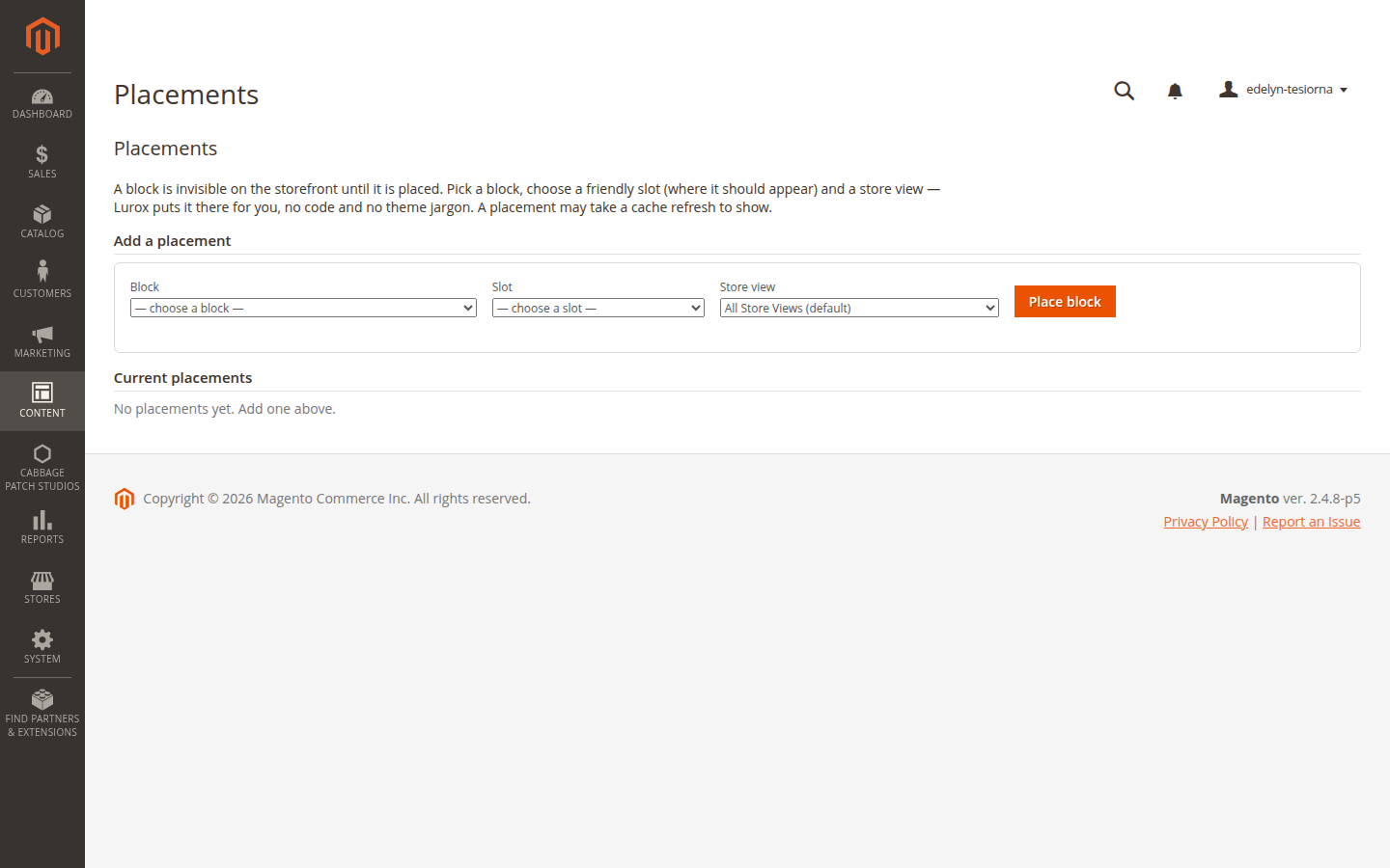
A block isn't visible until it's placed. Placements (Content → Lurox CMS → Placements) let you assign a block to a friendly, named storefront slot β for example a slot above the footer, or below the header β for a chosen store. No layout XML, no theme editing.
Pick the block, pick the slot, pick the store, and save. The block appears on that store's storefront in the matching position, and respects the store's theme.
Publishing & version history
Nothing you do in the editor is public until you publish. The action bar (bottom of the editor) gives you:
- Save Draft β store your work in progress; the storefront is unchanged.
- Publish to Live β make the current draft the live version.
- Schedule (Pro) β choose a future date and time to publish automatically.
- Share Preview β generate a private link so a colleague can review the draft without admin access.
- Discard β throw away the current draft and return to the published version.
Version history & rollback
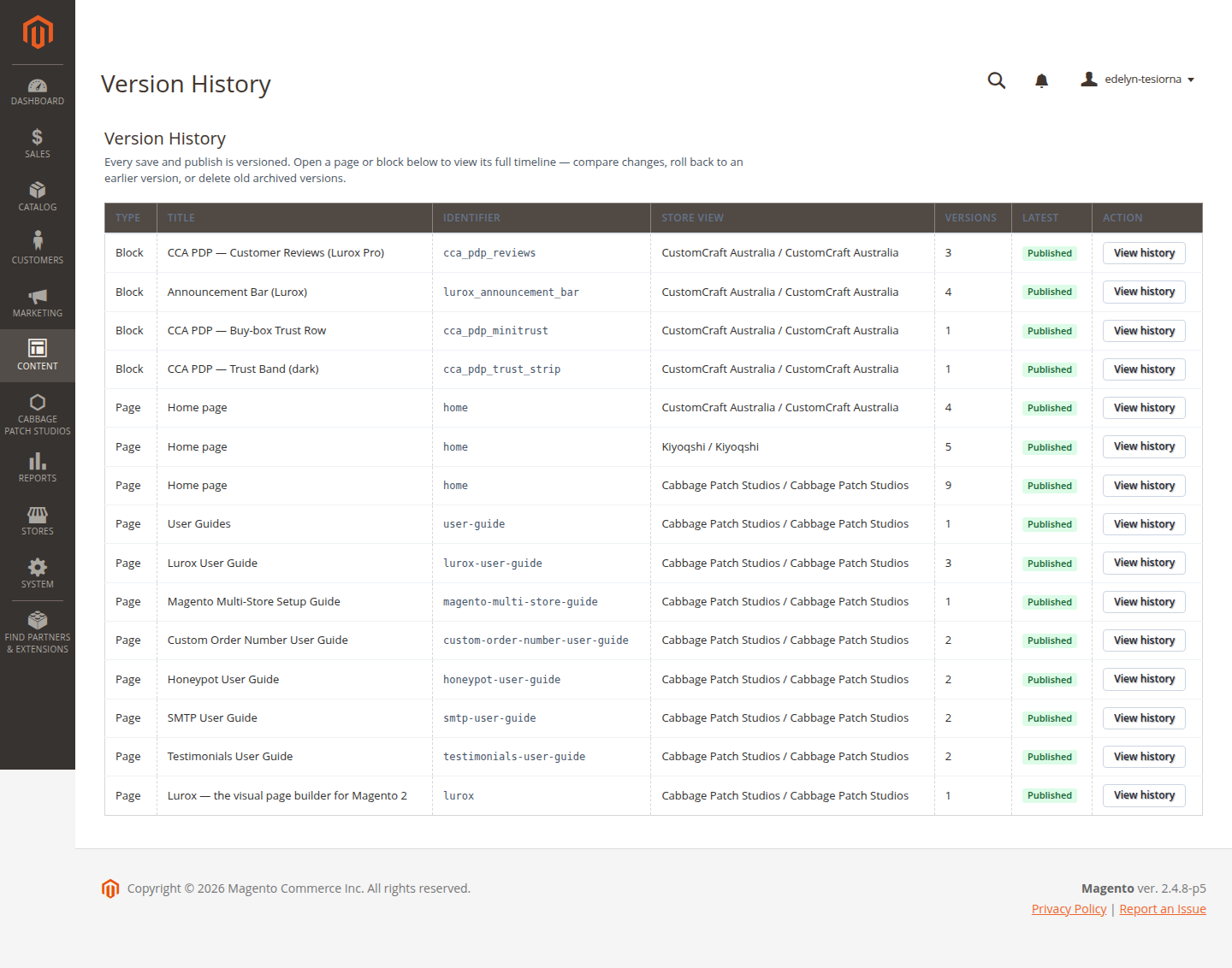
Every save and every publish is recorded as a numbered version with the date and the author. Open Version History to see the full trail, compare what changed, and roll back to any earlier version in one click. This is the same versioning that powers the changelog at the bottom of every guide in this library.
Design tokens (Advanced)
Colours, spacing and typography across your Lurox components come from a shared set of design tokens β your theme's design system in one place. Editing a token (say, your primary brand colour) updates every component that uses it, so your pages stay visually consistent without touching each block.
The token editor is the advanced surface for store-wide look and feel. Most day-to-day content work never needs it, but it's there when you want to tune the brand.
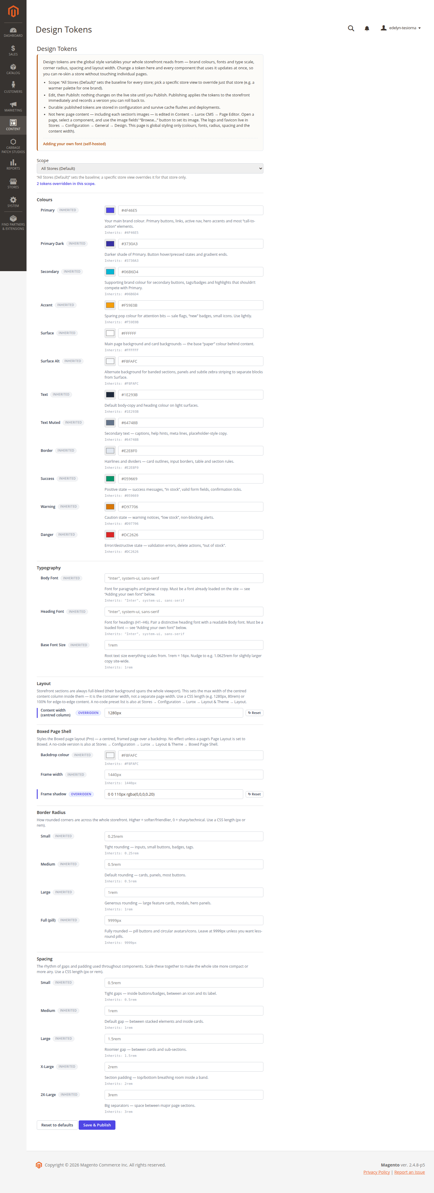
Two recent improvements make the editor easier to use. Every field now explains where it's used β a short description sits under each colour, radius and spacing control β and the Scope dropdown loads that store's own live colours. Switch from “All Stores (Default)” to a specific store and the swatches repaint to that store's real palette (a brass storefront vs an indigo one, say), so you always tune against what that store actually shows.
Adding your own font (self-hosted)
The Body Font and Heading Font fields use a font that is already loaded on the site. Lurox self-hosts every font β no Google Fonts, no CDN β so a brand-new font is added once at the theme level, then chosen here. Any font is supported, however unusual; it's currently a quick build step:
- Get the font as a
.woff2file (convert an.otf/.ttfwith any “ttf to woff2” tool if needed), and make sure you're licensed to self-host it. - Save it into the theme fonts folder, one folder per family:
app/design/frontend/CPS/lurox-base/web/fonts/<your-font>/YourFont.woff2 - Register it with an
@font-faceblock inweb/src/css/fonts.cssβ setfont-family, thesrcURL, the weight range andfont-display: swap. - Rebuild the storefront CSS so the font ships:
lurox:build --theme=all. - Back in Design Tokens, set Body Font or Heading Font to the family plus a fallback, e.g.
"Your Font", system-ui, sans-serif, then Save & Publish.
No access to the theme files or the build command? Send the .woff2, the family name and the weights to whoever manages your Lurox build β steps 2–4 are theirs, then you do step 5 here. A no-code “upload a font” option is on the roadmap. The same checklist also lives inside the Design Tokens editor, under “Adding your own font”.
Spotlight: the Split Hero component
The Split Hero (Pro) is a premium two-column hero for the top of a homepage or landing page. On the left it carries an eyebrow, a headline with an optional gradient-highlighted phrase, a short paragraph, up to two buttons and a row of stat chips. On the right it shows either your own image or a built-in “page editor” mock that shows off the builder itself. Everything sits on a dark indigo gradient band.
Reach for Split Hero when the hero should sell the product next to the headline. For a simpler full-width headline over a single background photo, use Hero banner instead.
Adding it and its fields
In the editor, click + Add Component and choose Split Hero (under Marketing). Fill in the fields:
| Field | What it does |
|---|---|
| Heading | The main headline (required). |
| Heading highlight | An optional trailing phrase shown in the indigo→violet gradient. |
| Eyebrow | Small uppercase label above the heading. |
| Subheading | One or two supporting sentences. |
| Primary / Secondary CTA | Up to two buttons — each needs both a label and a URL to appear. |
| Stat chips | Up to six small “value + label” chips under the buttons (e.g. 7 free components). |
| Band style | Dropdown for the dark band. Brand (default) follows your theme’s colours automatically; Slate and Midnight are fixed neutral darks. Text stays white on all three. |
| Right-side image | Optional. Leave empty to show the built-in editor mock; set it to show your own image. |
The right-hand visual: mock or your own image
By default — with the image field empty — Split Hero renders a self-contained “page editor” mock (the little window with coloured dots, a component rail and placeholder rows). It needs no image and looks the same on every theme, which makes it a great default for a product or agency homepage.
To use your own picture instead, put an image URL in the Right-side image field. That brings us to how images work across Lurox.
Working with images (SVG, WebP, PNG)
Any component that takes an image — Split Hero, Hero banner, Image & text, Logo strip — expects a URL, usually a file you have placed in the store’s media folder.
Where files live. Copy files under pub/media/… on the server and reference them with a /media/… URL. For this store we keep brand assets under pub/media/lurox/cps/ — so a file saved as pub/media/lurox/cps/hero.webp is referenced in the editor as /media/lurox/cps/hero.webp.
Which format to choose:
| Format | Best for | Why |
|---|---|---|
| SVG | Logos, icons, diagrams, UI mockups | Vector — razor-sharp at any size, tiny file, and you can hand-edit its colours in a text editor. (Our editor-mock and placeholder graphics are SVG.) |
| WebP | Photographs, screenshots | Same quality as JPEG/PNG at roughly a third of the size — the modern default for photos. |
| PNG / JPG | Fallback / source files | Universally supported. PNG keeps transparency; JPG suits photos when you cannot export WebP. |
Recommended sizes. The Split Hero’s right-side image shows at roughly half the hero width, so export it around 1200×900px (4:3) or 1200×1200px (1:1) — ~1200px wide stays crisp on retina screens. For a full-width background photo on other components (e.g. Hero banner) aim for 1600–1920px wide. A vector SVG has no fixed size. Compress before uploading and keep it under ~300KB — the hero is the first thing a visitor loads.
Self-hosted only. Lurox never loads images or fonts from a third-party CDN; everything is served from your own store. Upload the file rather than hot-linking someone else’s URL.
Colours & gradients (Advanced)
The dark band has a Band style dropdown in the editor. Brand (the default) follows your theme’s design tokens, so changing the palette in one place re-tints every Split Hero band across the store — true store-wide consistency. Slate and Midnight are fixed brand-independent neutrals. The exact gradient shape and the headline highlight are set in the component. Here is how they are built and where a developer changes them further.
- The dark band is a radial gradient from indigo to near-black with a soft violet glow layered on top:
radial-gradient(120% 120% at 80% -10%, #312E81, #0F172A 55%)plus a glowradial-gradient(50% 60% at 85% 20%, rgba(124,58,237,.35), transparent). - The headline highlight is a light indigo→violet gradient clipped to the text:
linear-gradient(90deg, #A5B4FC, #C4B5FD)withbackground-clip: text.
Changing the colours. Brand colours used across every component — buttons, links, accents — come from your theme’s design tokens (see Design tokens): edit --lurox-color-primary, --lurox-color-accent and friends in the theme’s theme.css, then rebuild with lurox:build. The Split Hero’s Brand band now derives from those same tokens (--lurox-color-primary-dark and --lurox-color-secondary), so it recolours with the rest of the store — no template edit needed. The fixed Slate/Midnight bands and the exact gradient shape live in the component template (split_hero.phtml) if you ever want to tune them; on a production server, reload PHP after editing a template so the change is picked up.
Changelog
This guide is itself a Lurox page. Every revision is a published version in Lurox's built-in content history, so we can roll any guide back to an earlier version at any time. The public changelog below tracks what changed and when.
1 July 2026
- Design Tokens editor: added a step-by-step “Adding your own font” guide (self-hosted
.woff2→@font-face→ rebuild → select). - Every token field now shows a plain-language description of where it’s used.
- The Scope dropdown now loads each store’s real theme colours, so switching store repaints the swatches to that store’s palette.
1 July 2026
- Added the Split Hero component spotlight: its fields, the built-in editor mock vs your own image, working with images (SVG / WebP / PNG) and where files live, and how the band & headline gradients and colours are set.
30 June 2026
- Initial publication covering the editor, components, Block Templates, Placements, publishing & version history, and design tokens.
Explore the rest of the library
Browse every Cabbage Patch Studios user guide in one place.
All User Guides